91%
During April 2024 to March 2025, 91% of adults in England reported arts engagement in the previous 12 months. According to GOV.UK Participation Survey headline findings.
Current promotions: Buy 2 get 1 free | Sales up to 33% on select products | Delivery by: 15 October - 22 October if ordered today
Hanging the next room
Seascape print comparison | Published 7 July 2026
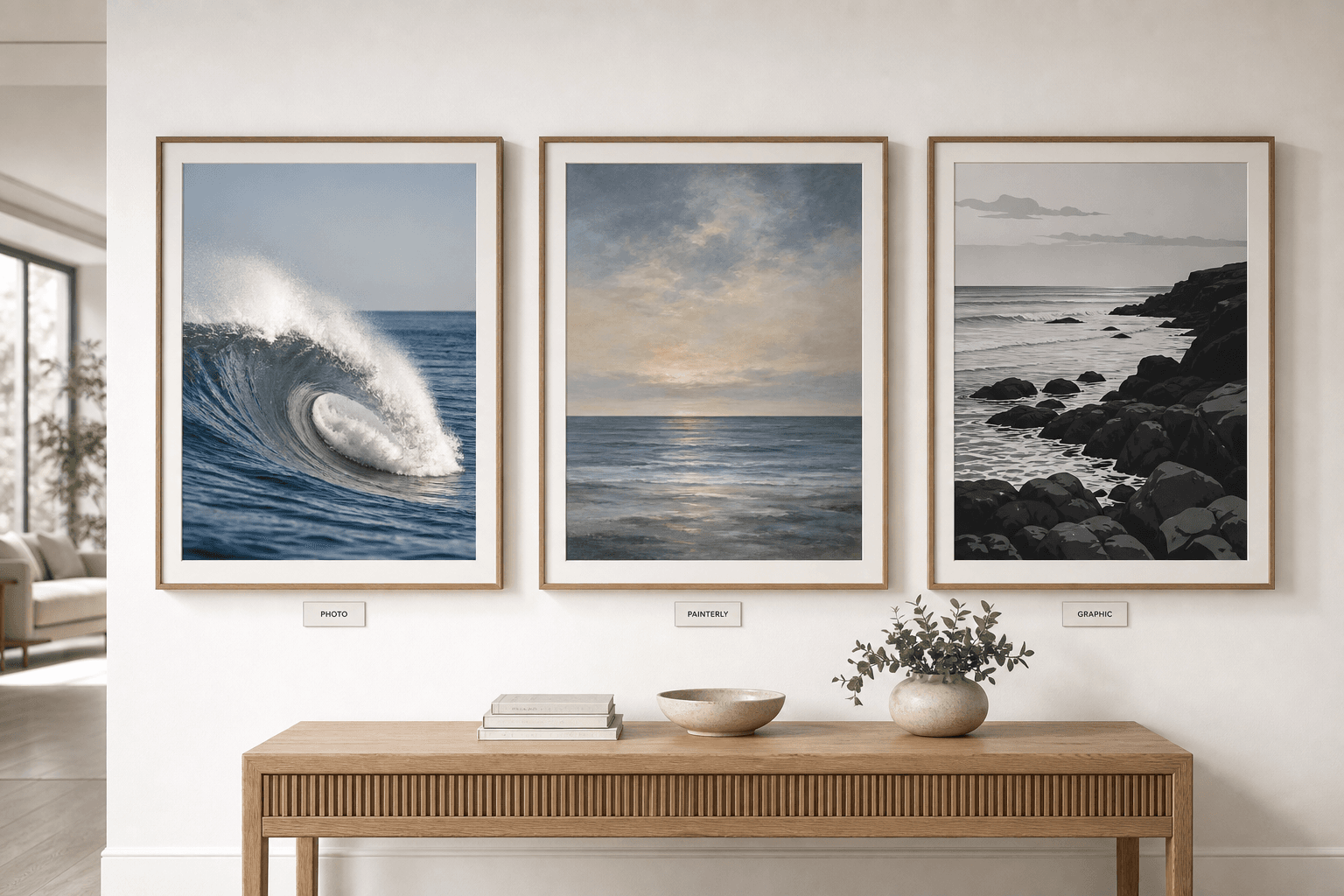
Choose a painterly seascape print when the room needs softness, an ocean photograph when it needs sharp realism, and a graphic coastal print when it needs contrast. The finish matters because the same sea subject can behave as calm horizon, crisp detail or bold shape from sofa distance.
Last updated 7 July 2026.
TL;DR: a seascape print is the safer choice for calm bedrooms and soft living rooms; an ocean photograph print is better for offices, hallways and spaces that need realism; a graphic coastal print is best for monochrome schemes or modern rooms that need stronger shape.
91%
During April 2024 to March 2025, 91% of adults in England reported arts engagement in the previous 12 months. According to GOV.UK Participation Survey headline findings.
7,182
The Frontiers in Public Health paper on creating arts and crafting analysed data from 7,182 adults. According to Frontiers in Public Health.
2020-2030
Arts Council England sets out its cultural strategy across 2020 to 2030, which is why this guide treats wall art as part of a wider visual-culture choice. According to Arts Council England strategy.
Direct answer
Choose by visual behaviour, not just subject. A seascape print usually softens the sea into horizon, light and atmosphere. An ocean photograph keeps water detail visible, so it feels sharper and more documentary. A graphic coastal print reduces the shore to shape, tone and contrast.
This page sits between the collection and the broader edit. If you are still choosing by subject, start with the , then return here to decide the finish.
Choose this when the room needs calm, depth and one slow horizon line.
Bedrooms, quiet living rooms and low-contrast sofa walls.
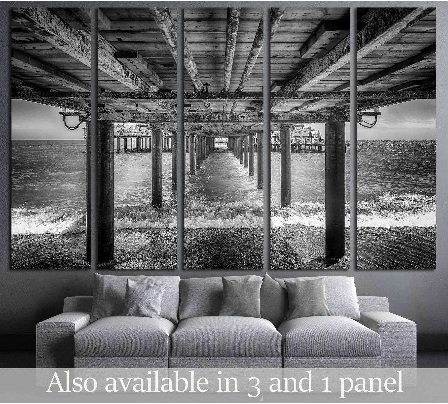
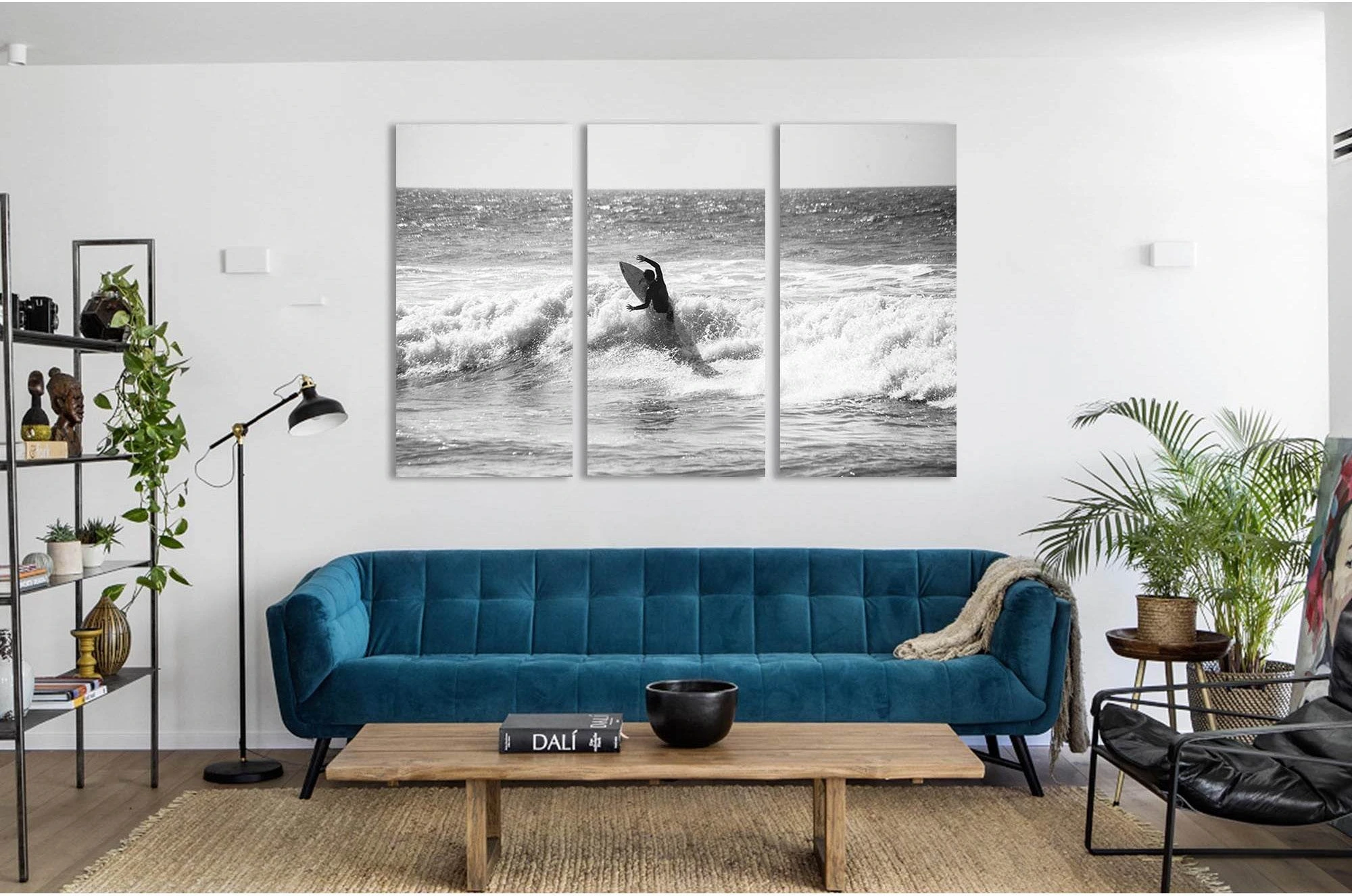
Choose this when realism, spray, rock, pier detail or surf texture should be visible.
Home offices, hallways, modern flats and rooms with clean furniture lines.
Choose this when the wall needs shape, contrast and a modern coastal edge.
Monochrome schemes, compact offices, rental flats and architectural interiors.
Comparison
Tate treats photography, print and landscape as separate art terms, which is why a sea image should be described by both subject and medium. A coastal photograph is not the same room object as a painterly seascape print, even when both show water, sky and shore.
In plain shopping terms, use Tate photography terminology for realistic image capture, Tate print terminology for the wall-art object, and Tate landscape terminology for the wider natural scene. That distinction keeps the page useful instead of treating every sea picture as interchangeable.
Soft edges, brush texture, atmospheric sky and a composed horizon.
Sharp detail, real water movement, recognisable light and photographic depth.
Simplified coastline, strong tonal blocks and less literal seaside detail.
Room fit
Use a painterly seascape when the room needs lower visual speed, use an ocean photograph when it needs detail, and use graphic coastal art when it needs shape. The finish should support the room job before it matches cushions, paint or accessories.
Painterly
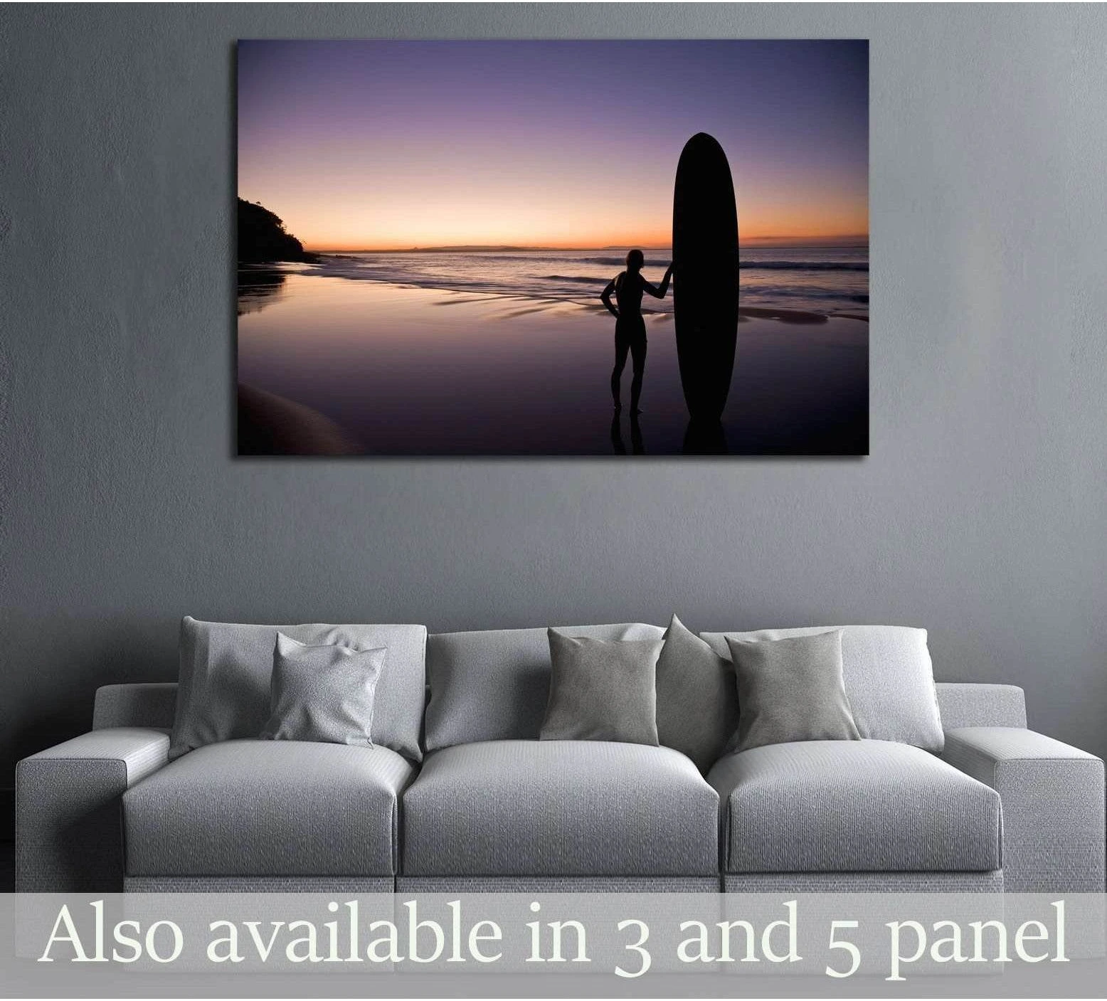
A painterly seascape print works best when the wall needs atmosphere rather than factual detail. Soft edges, wide sky and a low horizon make the artwork easier to live with in a bedroom, reading corner or calm living room.
The safest Zellart path is to start with seascape canvas, then choose the print with the clearest horizon line. Wide sea views read from further away, so they usually suit sofa walls better than small detailed coastal scenes.
Photographic
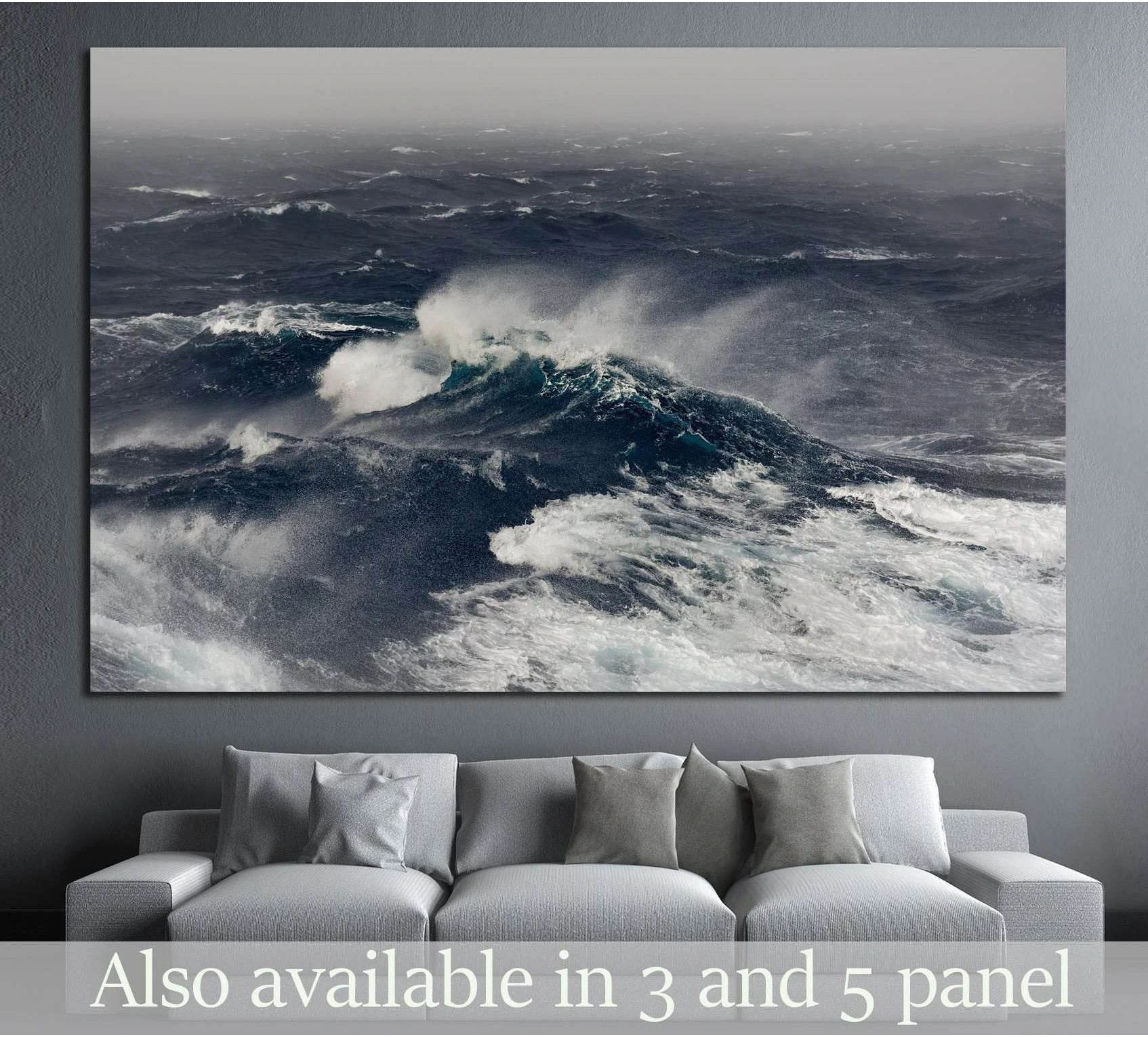
An ocean photograph print works best when the room needs realism, movement or a precise focal point. Spray, surf, piers and rocky shorelines create a stronger visual signal than a soft horizon, so they suit hallways, studies and modern living rooms.
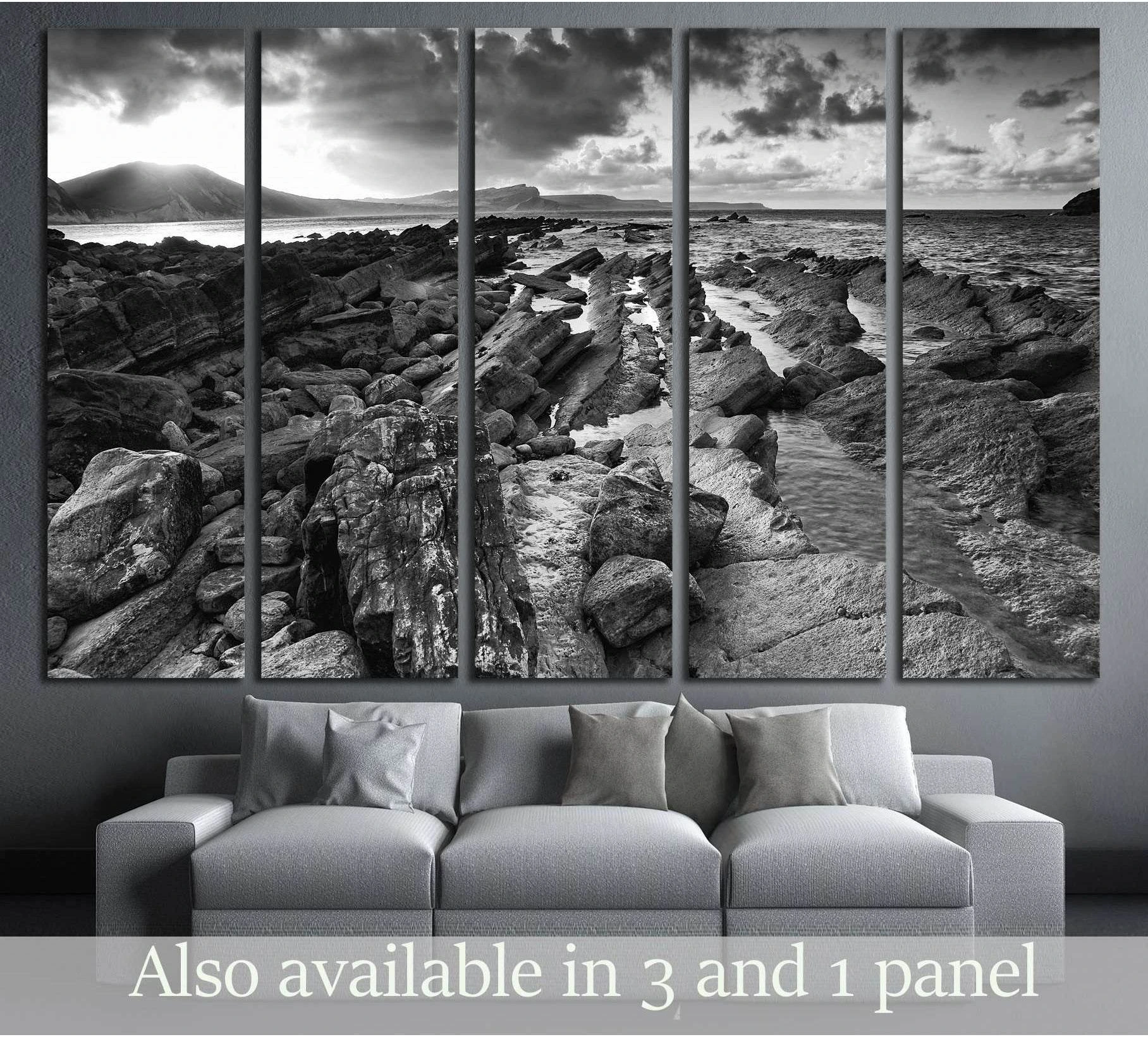
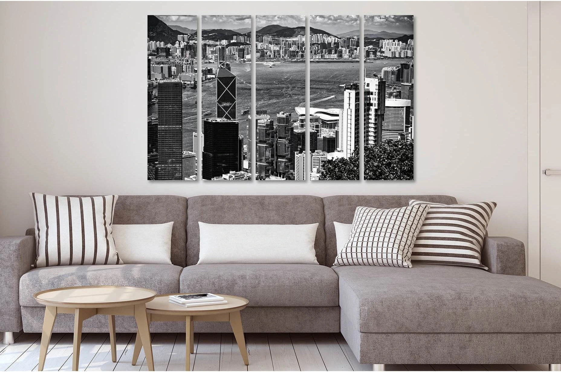
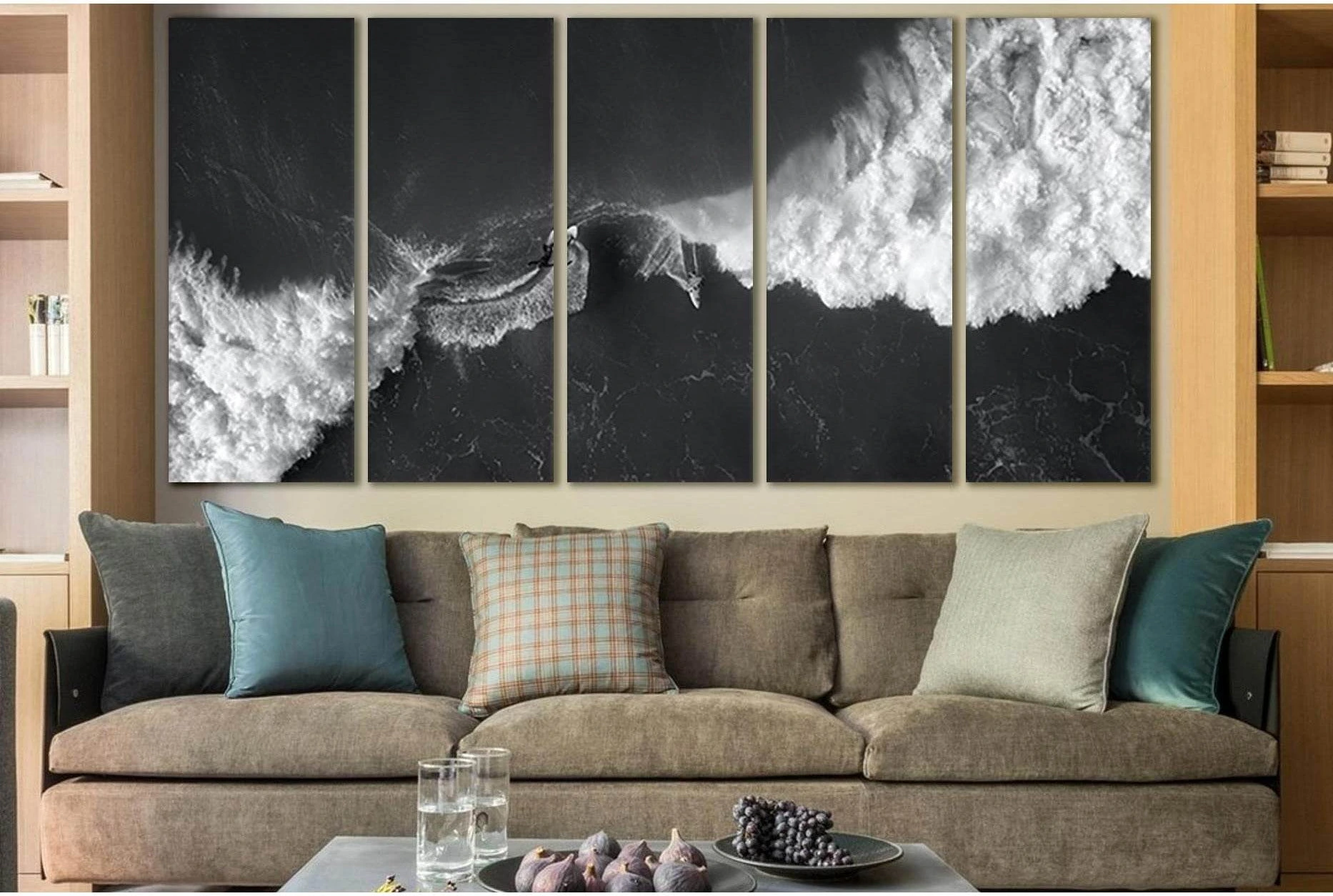
This is also where black-and-white sea imagery becomes useful. Removing colour lets the room keep the subject while leaning on tone, shadow and shape, so compare ocean photographs with black and white wall art when a blue print would fight the room palette.
Graphic
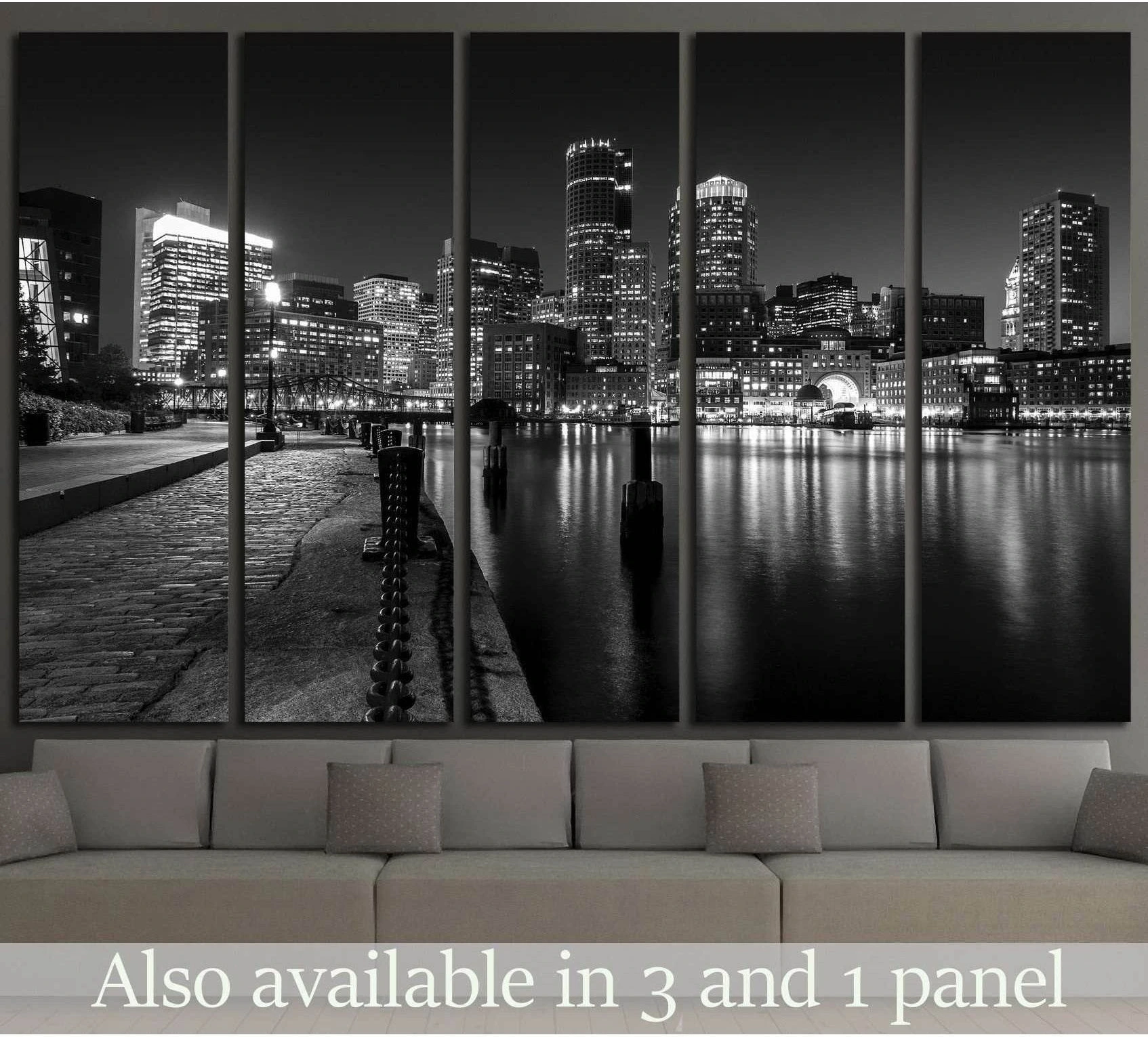
A graphic coastal print works best when the room needs contrast more than softness. It turns the sea or shore into an arrangement of light, dark and simplified shape, which can make a compact office, dining wall or rental flat feel more intentional.
Treat graphic coast art as a design element, not as a beach theme. It should connect to furniture lines, black accents, oak, stone or plaster texture. If the room already feels hard, return to a painterly horizon instead.
Evidence
A wall print should not be described as a wellbeing treatment. The stronger, verifiable claim is that arts and visual culture are widely engaged with: GOV.UK reported 91% adult arts engagement in England during 2024/25, according to the DCMS Participation Survey headline findings.
The 2024 Frontiers in Public Health arts and crafting study analysed 7,182 adults and found positive associations between creating arts or crafting and subjective wellbeing. That is useful context for the value of creative participation, but buying a seascape print is a design decision: the claim here is about image type, room fit and visual behaviour.
Zellart coastal picks
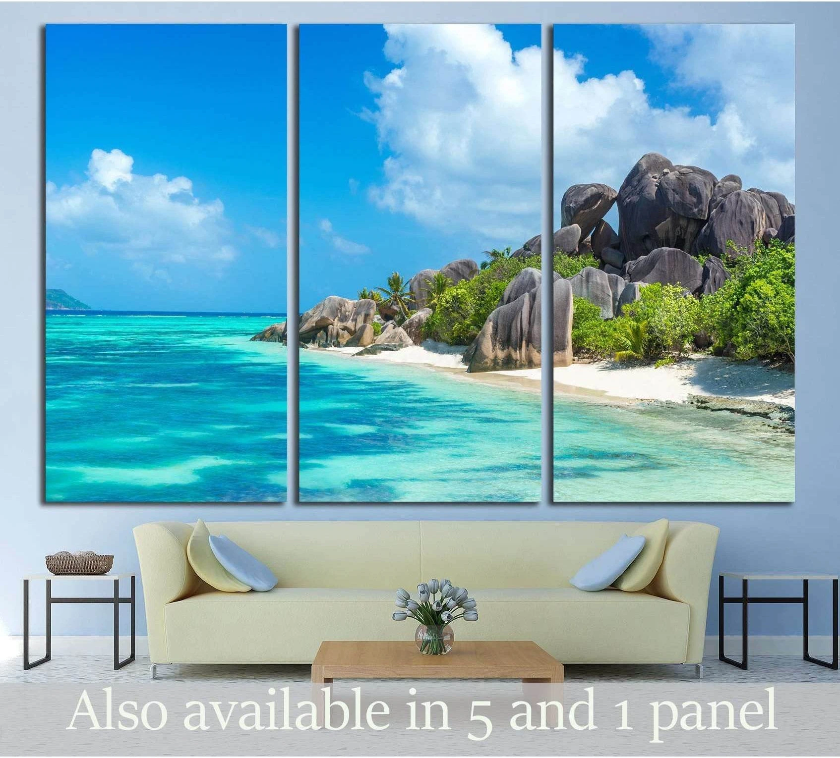
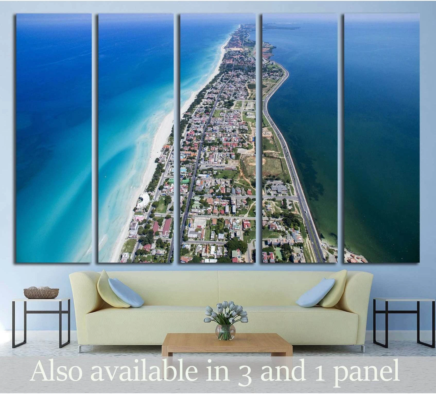
These grids use current Zellart collection data for images, prices and availability. Start with seascape canvas for soft horizons, use ocean wall art for water detail, and compare black and white wall art when the room needs stronger shape.
Soft horizons, wider sea views and atmospheric skies for rooms that need depth without hard edges.
Open collection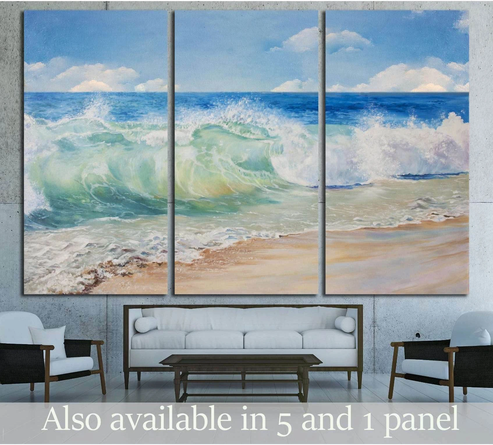 Sale
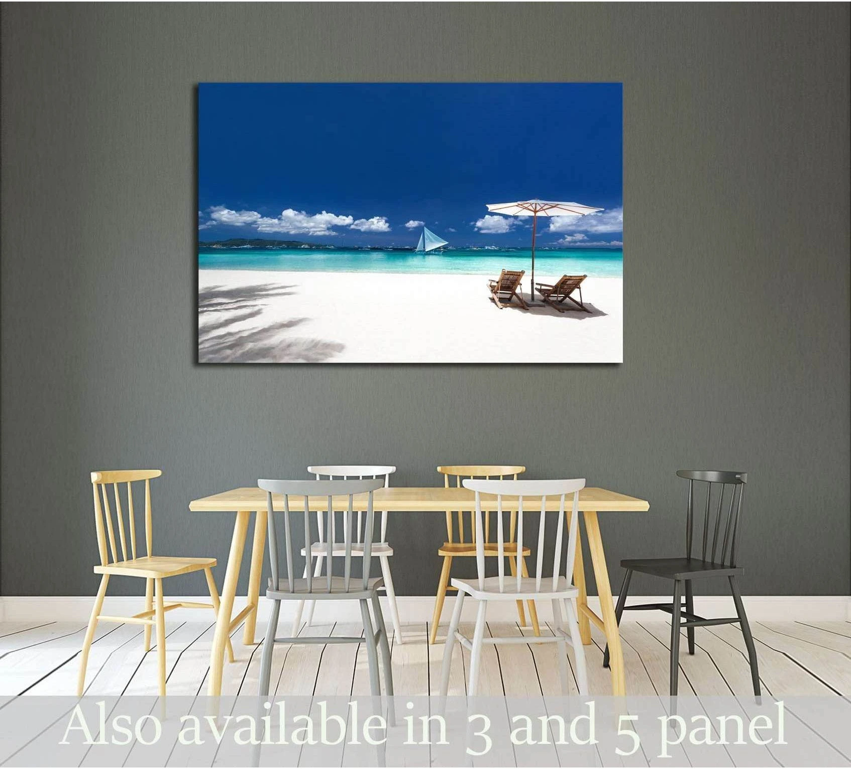
SalePainterly seascape prints
From £60.82
Size options on product page
 Sale
SalePainterly seascape prints
From £60.82
Size options on product page
 Sale
SalePainterly seascape prints
From £60.82
Size options on product page
 Sale
SalePainterly seascape prints
From £60.82
Size options on product page
Crisp waves, piers, surfers and open-water details for rooms where realism should carry the wall.
Open collectionMonochrome shores, abstract coast textures and graphic water lines for modern rooms that need contrast.
Open collectionFAQ
A seascape print is a sea, coast or horizon image made as wall art, often with a painterly or graphic treatment. An ocean photograph print is based on photographic realism, so it shows sharper wave detail, light, spray, shore texture and the physical character of the scene.
A seascape canvas is usually better for bedrooms when it has a soft horizon, pale foam, muted blue or low-contrast sky. The canvas format gives the wall one quiet object, while very sharp wave photographs can feel more active above a bed.
Choose an ocean photograph print when the room needs clarity, energy or realism. It works especially well in offices, hallways and modern living rooms where wave movement, piers, surfers, rocks or black-and-white water detail can give the wall structure.
A home office usually suits a sharp ocean photograph, a black-and-white shore or a graphic coastal print. These options read clearly behind a desk and on video calls. Avoid soft, vague sea views if the workspace already lacks visual structure.
Black-and-white seascapes work well in coastal rooms when the room already has natural texture: oak, linen, stone, rattan, plaster or black metal. Monochrome keeps the coastal subject grown-up because the image relies on tone and shape rather than beach colour.
Choose one large seascape print when the wall needs one calm anchor, especially above a sofa or bed. Choose several smaller sea prints only when each image has a distinct job, such as one horizon, one close-up wave and one graphic shore.
Ocean photograph prints
From £60.82
Size options on product page
Graphic and monochrome coastal prints
From £60.82
Size options on product page