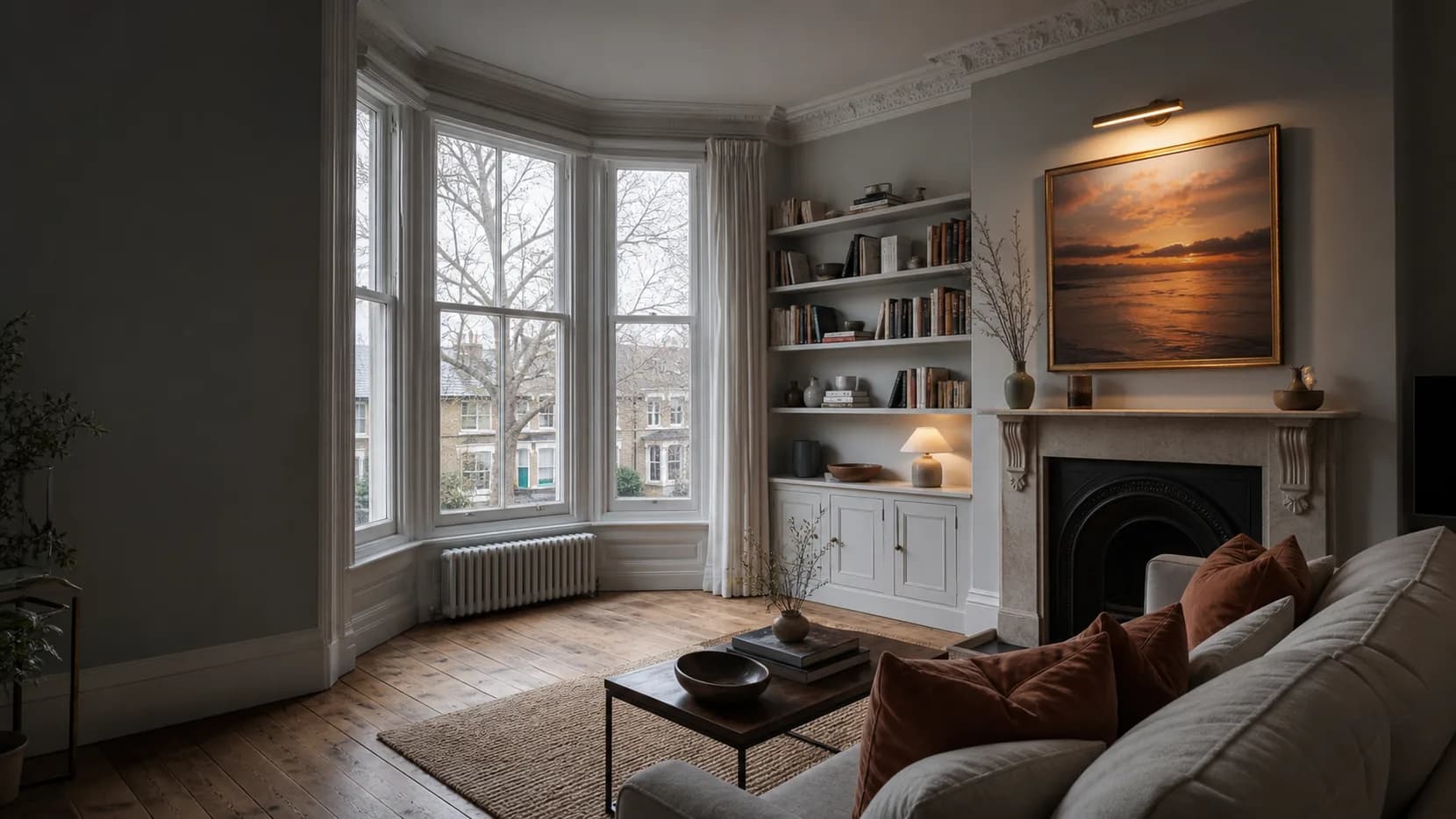
Retro interiors work best when they are treated as a discipline, not a costume. The useful lesson is not to recreate a period room, but to borrow the parts of older design language that still help a contemporary wall feel composed: clean structure, warm material contrast, and colour used with intent.
Homes & Gardens describes mid-century modern interiors through uncluttered layouts, sleek lines, functional furniture, and a mix of traditional and non-traditional materials. It also notes the familiar balance of neutral palettes with stronger accent colour. That gives a practical starting point for wall art: let the room stay calm, then allow one framed piece, or one tight pairing, to carry the accent rather than spreading attention across every surface. https://homesandgardens.com/interior-design/what-is-mid-century-modern-interior-design
The same idea appears in The Spruce's overview of midcentury modern style, which emphasises clean, simple lines, functionality, and contrasts between materials. For a wall, that suggests restraint. A print above a sofa, console, or low cabinet should feel related to the furniture below it: not necessarily matched, but proportionate. If the room already has strong timber, brass, or stone notes, the artwork can echo one of those temperatures rather than adding a completely new one. https://thespruce.com/things-you-should-know-about-mid-century-1391827
This is where retro becomes useful for Zellart rather than merely decorative. A graphic piece can sharpen a soft room; a quieter composition can calm patterned upholstery or a busy shelf wall. If the room needs bolder rhythm, Pop art wall art is a helpful visual reference because it shows how saturated colour and simple shape can be controlled by framing, scale, and negative space. Used carefully, that energy can feel architectural rather than noisy.
Vintage-led interiors add a different lesson. Homes & Gardens frames vintage not as a final accessory but as a source of depth and detail, and it discusses a move toward more organic and curving forms. For wall art, that does not mean every piece has to look old. It means the wall can carry some evidence of touch: softer edges, a less clinical palette, or a subject that feels collected rather than newly staged. https://homesandgardens.com/interior-design/vintage-trends-2026
A contemporary room can still hold that feeling. If the furniture is square, white, and efficient, art with curve or texture can soften it. If the room already has vintage furniture, the better choice may be cleaner and more modern, so the wall does not collapse into pastiche. Contemporary wall art can be useful here as a counterweight: a reminder that retro references often land better when one element in the room remains crisp.
The practical rule is simple: choose one retro signal and let everything else support it. That signal might be colour, line, material warmth, or a vintage mood. It should not be all four at once. A room feels more confident when its references are edited; a wall feels more grown-up when its art has a job to do.
Sources
- Homes & Gardens: https://homesandgardens.com/interior-design/what-is-mid-century-modern-interior-design
- The Spruce: https://thespruce.com/things-you-should-know-about-mid-century-1391827
- Homes & Gardens: https://homesandgardens.com/interior-design/vintage-trends-2026