
Why do hotel lobbies treat art as behaviour design?
Hotel lobbies treat art as behaviour design because a lobby has to perform several jobs at once: orient the guest, signal quality, create memory, soften waiting time and make a public space emotionally legible. In servicescape theory, the physical environment influences emotional responses such as pleasure and arousal, and those responses can shape approach behaviour.[3]
A homeowner often asks, “Does this artwork match?” A hospitality designer asks, “What should this artwork make people feel and do?” That difference changes everything. Art above a sofa may simply complete a wall; art in a lobby can slow people down, guide them toward a bar, create a photo moment or make a brand feel local.
Four Seasons Hotel Madrid gives a clear example of art as atmosphere. Sleeper reports that the hotel includes over 2,000 contemporary artworks, curated by Paloma Fernández Iriondo, with emerging artists placed inside a historic building.[6]

Why can art create instant atmosphere in about eight seconds?
Art can create instant atmosphere because people read colour, scale, contrast and visual gist before they consciously analyse décor. The eight-second lobby idea is a practical design window: the short moment between entering a space and deciding whether it feels calm, expensive, creative, corporate, intimate or forgettable.
8-second entry sequence
A design heuristic for the first lobby read, not a universal scientific rule.
0–1 sec
Colour impression
1–3 sec
Subject recognition
3–5 sec
Scale and mood
5–8 sec
Memory hook
Visual science supports the speed of that first read. MIT News reported that the brain can identify images seen for as little as 13 milliseconds, and visual-design research found that people can form visual appeal judgments in about 50 milliseconds. These studies are not lobby-specific, but they explain why large, high-contrast visual cues matter immediately when someone enters a room.[1][2]
For a home, this means the first visible wall matters more than people think. For a business, the effect is sharper: a guest entering a café, restaurant, clinic, office, salon or boutique hotel reads the room before reading the menu, price list or brand story.
How do Four Seasons, Ace Hotels, and W Hotels use art differently?
Hotels use art differently depending on the emotional promise of the brand. Four Seasons leans toward curated calm and cultural refinement; Ace Hotels leans into creative community; W Hotels leans into colour, social energy and a nightlife-adjacent mood.

| Hotel playbook | What the art does | Evidence to link | What homeowners can borrow |
|---|---|---|---|
| Four Seasons | Makes luxury feel calm, curated and culturally serious. | Four Seasons describes a shift toward clean-lined contemporary serenity.[5] | Choose one large, refined statement piece instead of several timid fillers. |
| Four Seasons Madrid | Uses art at collection scale, not accessory scale. | Sleeper reports over 2,000 contemporary artworks at Four Seasons Hotel Madrid.[6] | Build a visual thread through the home: one hero piece, then smaller echoes. |
| Ace Hotels | Turns art into cultural programming and local creative identity. | Ace invites artists to turn hotel rooms into studios and showcase the work.[7] | Choose art that says something about taste, city, travel, music or creative identity. |
| W Hotels | Uses bold colour and social design to create a Living Room atmosphere. | W describes its Living Room as an all-hours social and community hub.[8] | Use stronger colour and scale in rooms meant for conversation. |
| W New York Union Square | Builds a layered, city-specific visual world. | W references architecture, subway lines, the city grid, street art and abstract expressionism.[9] | A cityscape or architectural print works best when it reflects the room’s rhythm. |
What is the difference between art as a statement and art as wallpaper?
Art as wallpaper fills empty space; art as a statement gives the room a point of view. Wallpaper art is usually small, safe, symmetrical and selected to disappear. Statement art is legible from a distance, has emotional direction and gives visitors something to remember.

| Type of art | What it does | Common mistake | Better hospitality-style move |
|---|---|---|---|
| Art as wallpaper | Blends into the room and reduces blankness. | Buying several small pieces because they go with cushions. | Use only where quiet repetition is the goal. |
| Art as statement | Defines the room’s mood, hierarchy and memory. | Choosing something bold but too small for the wall. | Use one oversized artwork where the eye lands first. |
| Art as wayfinding | Pulls people through a space. | Leaving hallways visually dead. | Use a strong cityscape, landscape or abstract at the end of a corridor. |
| Art as social signal | Tells guests what kind of host, brand or business this is. | Choosing generic pieces that say nothing. | Select art with a clear subject: skyline, sea, map, architecture or abstract colour. |
The easiest test is memory. If a guest leaves and can describe the artwork in one phrase, it worked.
What is controlled randomness in hospitality art curation?
Controlled randomness means the art collection feels varied, human and discovered, but still has hidden rules. Good hospitality curation avoids both extremes: it is not a rigid matching set, and it is not random decoration.

Downtown L.A. Proper is a useful example. Design Hotels describes Kelly Wearstler’s approach through a sense of place, local artists and a ceiling mural by Abel Macias that creates an entry experience where the eye wanders.[10]
Zellart framework
The 60 / 30 / 10 rule for art curation
60% common thread
Keep one clear link: warm neutrals, coastal blues, London references, black-and-white photography or expressive abstracts.
30% variation
Mix subjects, sizes or compositions so the room does not feel like a hotel corridor.
10% surprise
Add one piece with stronger colour, scale or contrast to create memory.
What does colour semiotics mean in commercial interiors?
Colour semiotics means using colour as a sign system. In commercial interiors, colour is not only aesthetic; it signals pace, price, warmth, freshness, privacy, confidence or energy.

Colour psychology should be used carefully because meaning changes by culture, lighting, material, personal experience and fashion. Kaya and Epps found systematic emotional associations across principal hues, while interior and surface-colour research shows that perception depends on the wider environment.[11][12][13]
| Colour direction | Common signal in interiors | Where hotels and businesses use it | Zellart-style art move |
|---|---|---|---|
| Deep blue / navy / ocean tones | Calm, trust, distance, evening luxury. | Bedrooms, lounges, hotel corridors, spa-like spaces. | Use ocean, coastal, abstract blue or night city prints. |
| Green / botanical tones | Rest, freshness, biophilic softness. | Wellness spaces, cafés, reception areas, slow dining. | Use botanical, forest, landscape or soft green abstract prints. |
| Red / orange / amber | Energy, appetite, warmth, social movement. | Bars, restaurants, W-style lounges, evening venues. | Use sunset cityscapes, warm abstracts, coffee and wine prints. |
| Black and white | Structure, confidence, editorial restraint. | Corporate spaces, corridors, monochrome hotel suites. | Use architectural prints, skyline photography or monochrome coffee art. |
| Gold / brass / ochre accents | Warm luxury and premium hospitality cues. | Lobbies, boutique hotels, cocktail bars, luxury lounges. | Use warm city lights, sepia maps, golden abstracts or framed canvas accents. |
How can homeowners apply hotel lobby art psychology?
Homeowners can apply hotel lobby art psychology by giving each main artwork a role. Do not start with colour matching. Start with the job of the room.
Entrance
Introduce the home’s identity in one glance.
Cityscape, soft landscape or expressive abstractLiving room
Give the room a visual anchor that reads from the doorway.
Large canvas print above the first sightline wallDining room
Support appetite, warmth and conversation.
Warm abstract, city lights or café-inspired printBedroom
Reduce visual noise and make the suite feel calmer.
Blue, green, coastal or misty landscape printHallway
Turn the far wall into a visual destination.
Cityscape, bridge, map or long landscapeHow can cafés, restaurants, and offices borrow from hotel lobbies?
For business interiors
Cafés, restaurants and offices can borrow from hotel lobbies by using art to control pace, memory and brand mood.
In retail-atmospherics research, pleasure and arousal are used to explain how environments influence approach behaviour, and Donovan and Rossiter linked enjoyable environments with more time spent shopping and return patronage.[14]
The same principles apply to art for business environments: cafés and restaurants that deliberately use oversized cityscape prints in narrow spaces borrow directly from hospitality playbooks.

What Zellart art categories fit the hospitality playbook?
Zellart’s collection structure supports this approach across office wall art, café and bar wall art, cityscape wall art, abstract wall art and map wall art.

Cityscape wall art
Make a room feel urban, memorable and more spacious.
Explore
Office wall art
Give receptions, meeting rooms and home offices a professional anchor.
Explore
Abstract wall art
Add modern energy without literal subject matter.
Explore
Map wall art
Add global, corporate or travel character.
ExploreWhich Zellart products fit the hotel-lobby method?
These hospitality-style prints are selected for scale, subject clarity, colour signal and memory value. Prices and availability are pulled from live product data.
Oversized cityscape prints for narrow spaces
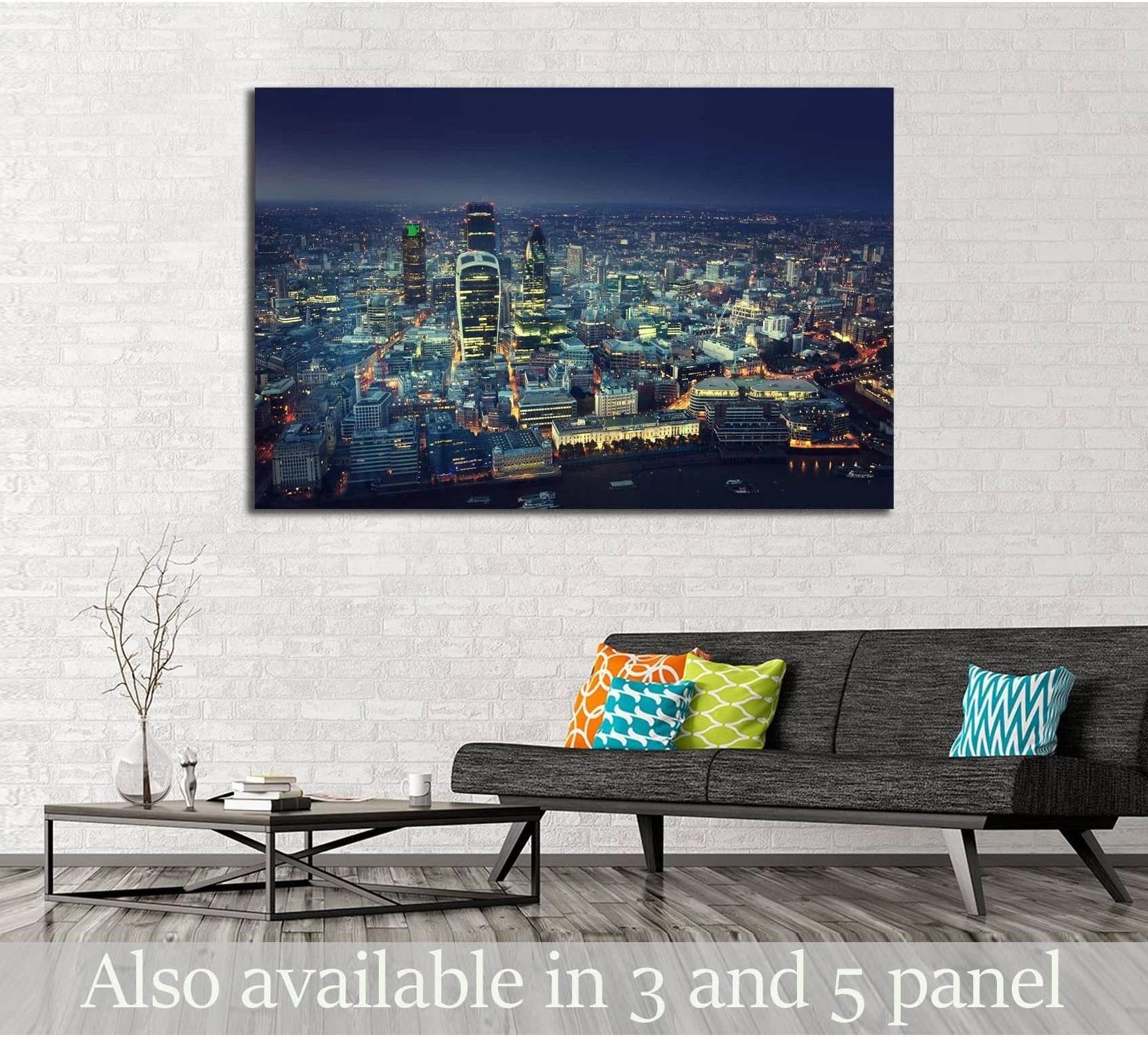
Lobby Mood
City of London At Sunset №2654 Ready to Hang Canvas Print
£60.82
Available now
Best placement: Narrow café, hallway, office reception, dining room.
Sunset skyline colour gives warmth, depth and a clear urban memory hook.
View print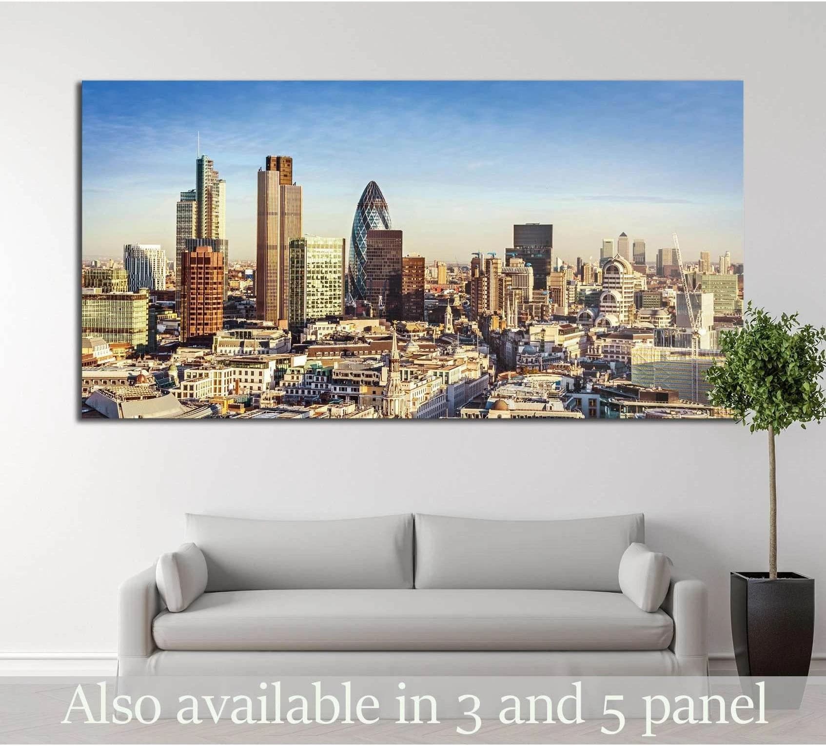
Office Mood
London Skyline Canvas Print with Modern Skyscrapers and Blue Sky
£79.78
Available now
Best placement: Finance office, meeting room, corporate reception.
London architecture signals business, scale and professional confidence.
View print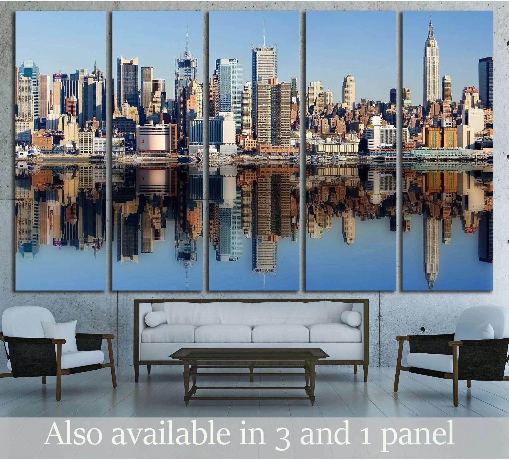
Social Mood
New York City №2580 Ready to Hang Canvas Print
£60.82
Available now
Best placement: Apartment living room, bar, restaurant, office lounge.
Water reflections and skyline rhythm create a classic hospitality-style focal wall.
View print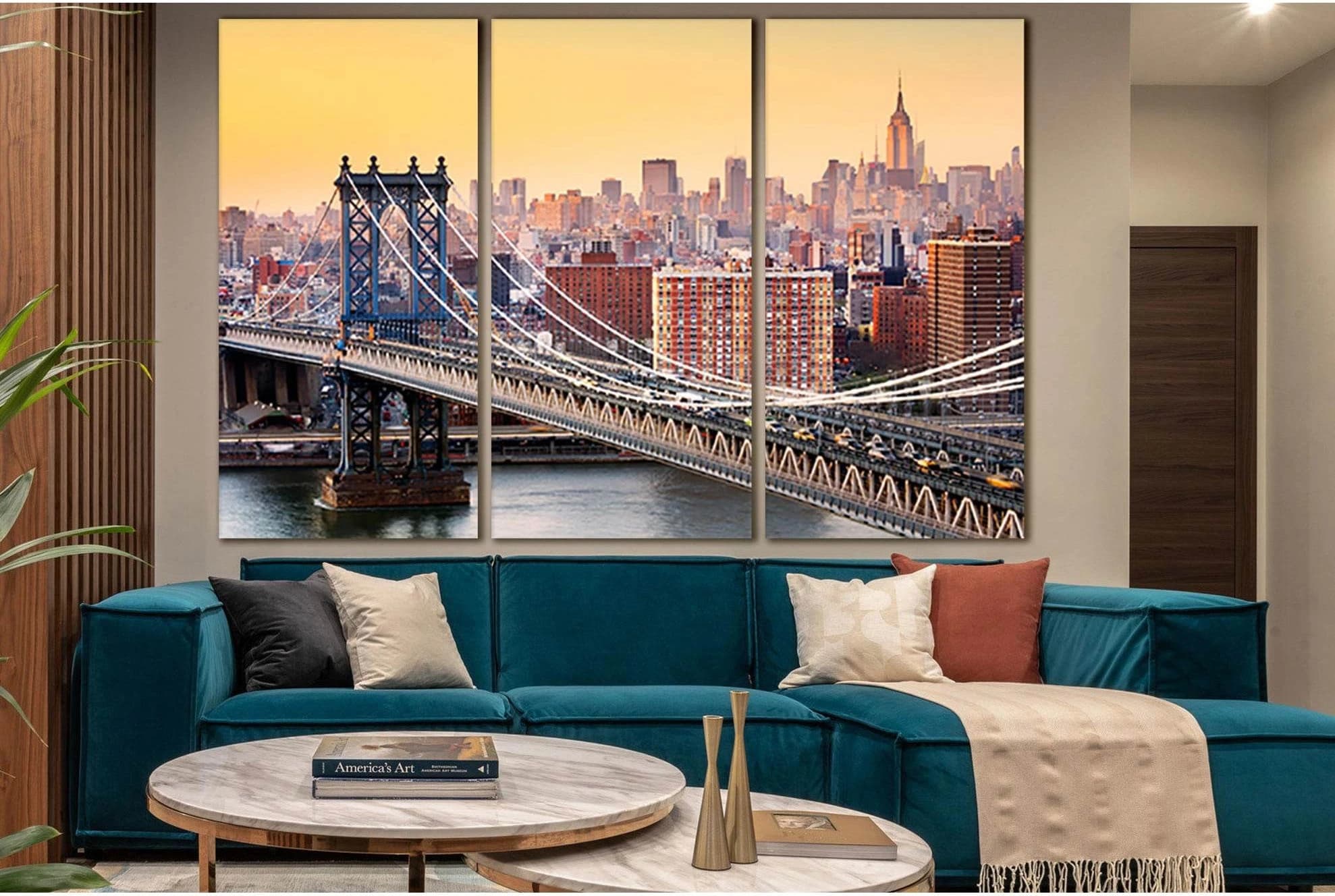
Wayfinding Mood
Warm Sunset Bridge Cityscape Wall Art Canvas Print
£60.82
Available now
Best placement: Corridor, open-plan office, industrial café.
Bridge perspective works like visual wayfinding and pulls the eye through the room.
View printStatement abstracts for modern lobbies and homes
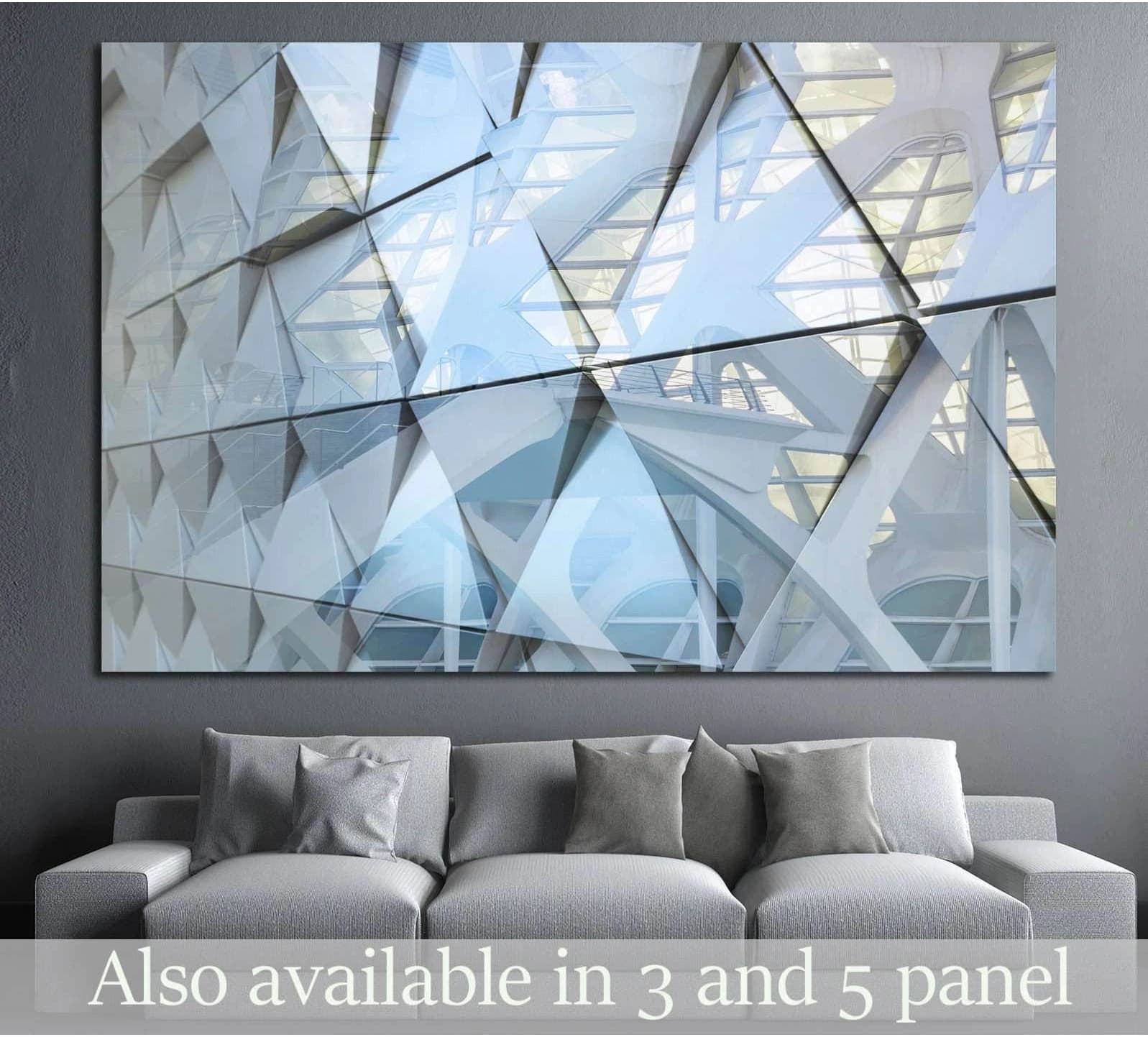
Lobby Mood
Abstract architectural detail №1601 Ready to Hang Canvas Print
£60.82
Available now
Best placement: Reception, office, hallway, modern living room.
Architectural abstraction feels designed, structured and quietly premium.
View print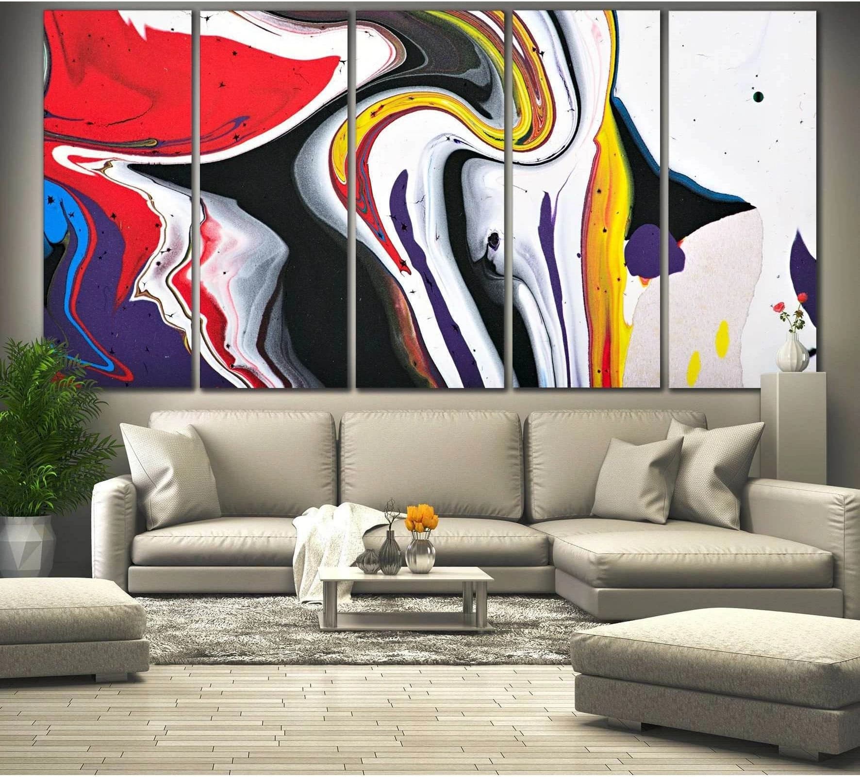
Statement Mood
Abstract Wall Art №784 Ready to Hang Canvas Print
£79.78
Available now
Best placement: Dining room, lounge, creative office, hotel-inspired home.
Strong red, yellow, black and purple contrast creates a memorable statement wall.
View print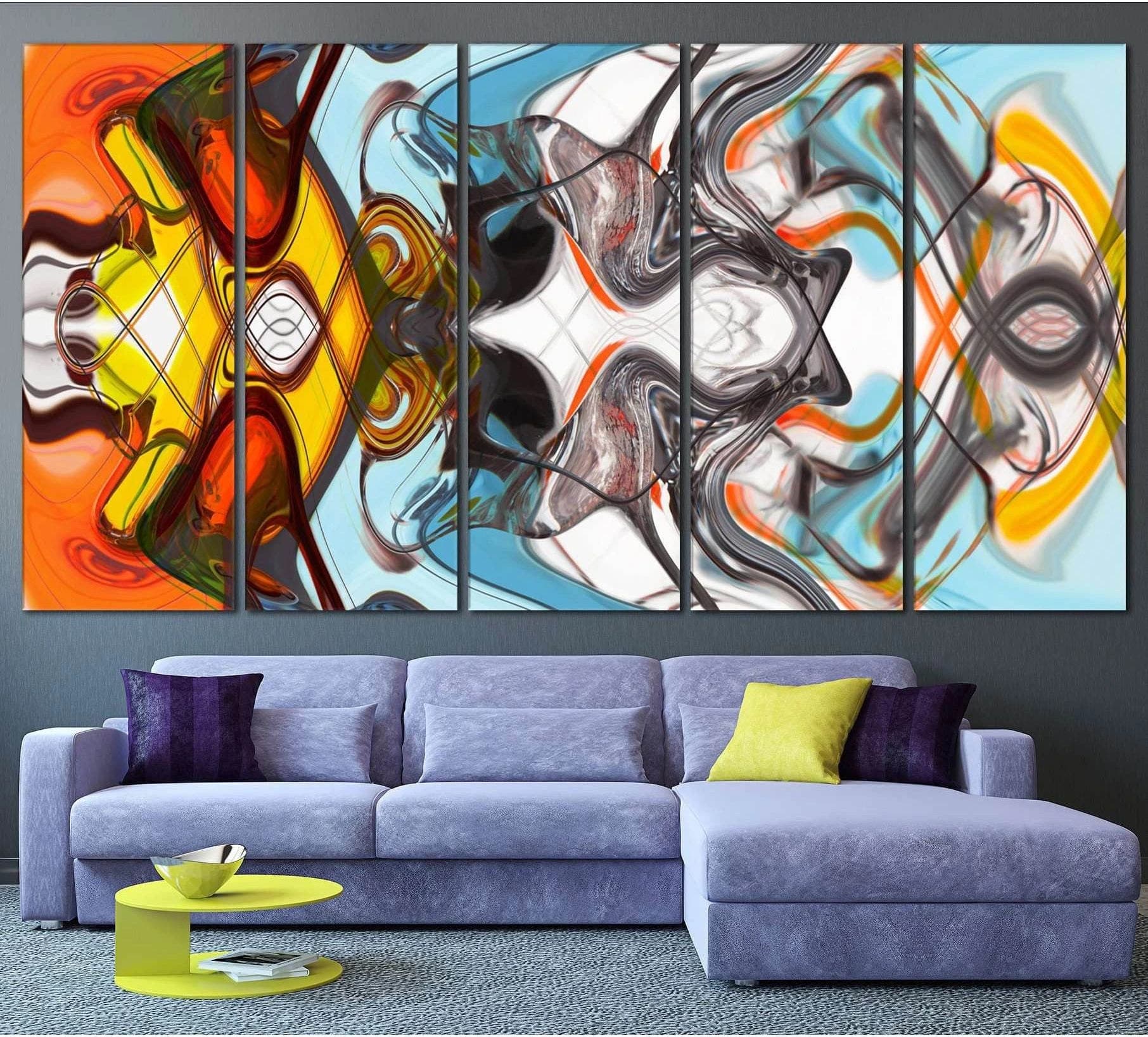
Café Mood
Colorful Abstract №787 Ready to Hang Canvas Print
£79.78
Available now
Best placement: Restaurant, bar, social kitchen, creative studio.
Warm orange and aqua energy fits spaces where conversation and movement matter.
View print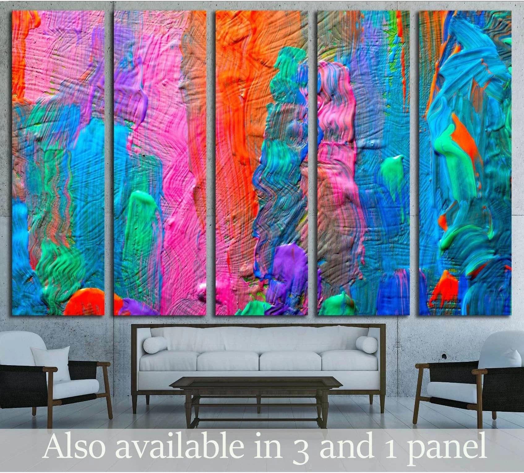
Surprise Mood
Abstract art background. Hand-painted background. SELF MADE №2881 Ready to Hang Canvas Print
£60.82
Available now
Best placement: Boutique salon, café corner, home office, accent wall.
Bright multi-colour panels bring controlled surprise without needing a literal subject.
View printCafé, bar and restaurant atmosphere prints
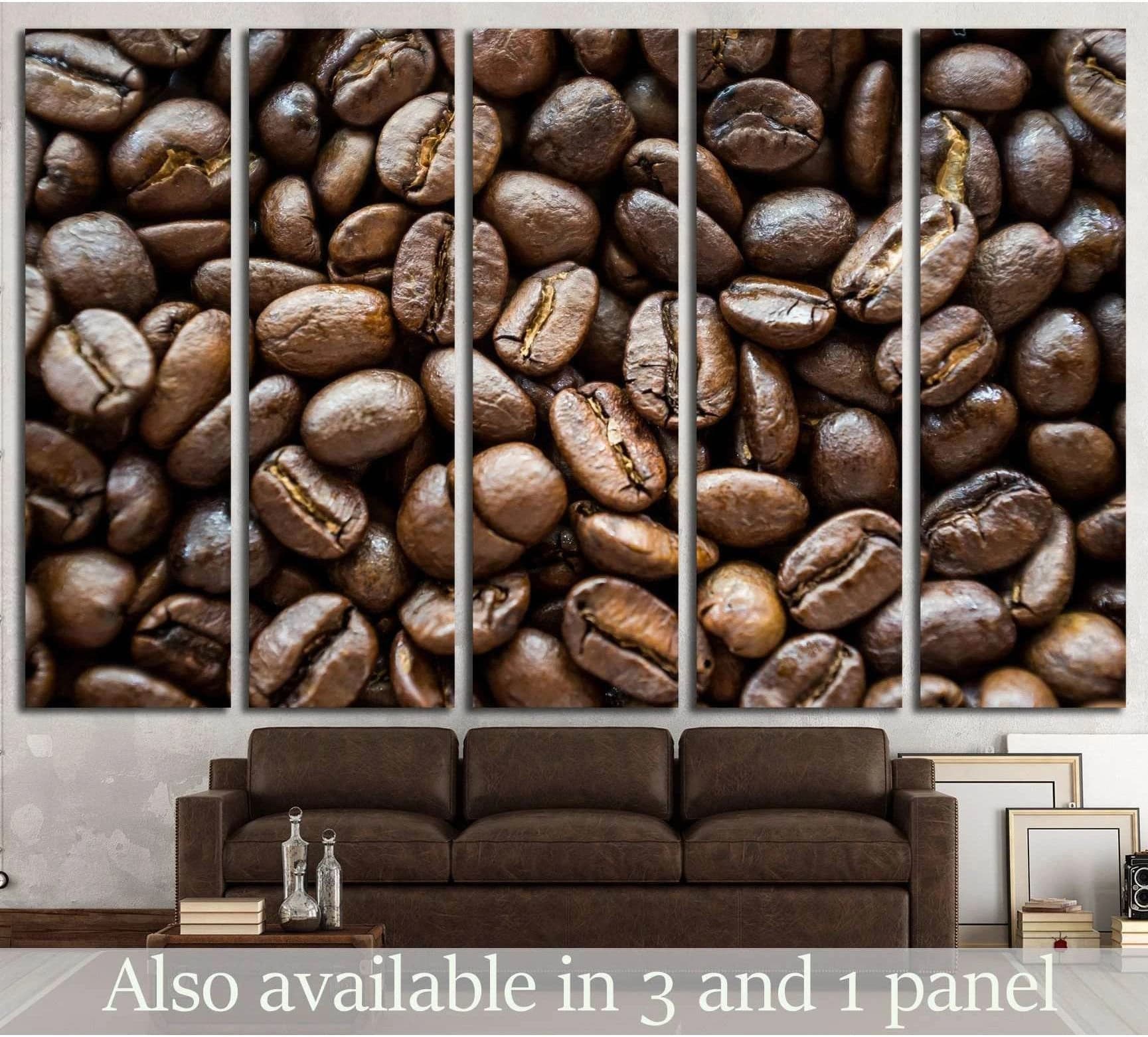
Café Mood
Coffee beans №1913 Ready to Hang Canvas Print
£60.82
Available now
Best placement: Coffee shop, kitchen, breakfast nook, café counter wall.
Literal coffee imagery strengthens the sensory cue before the drink arrives.
View print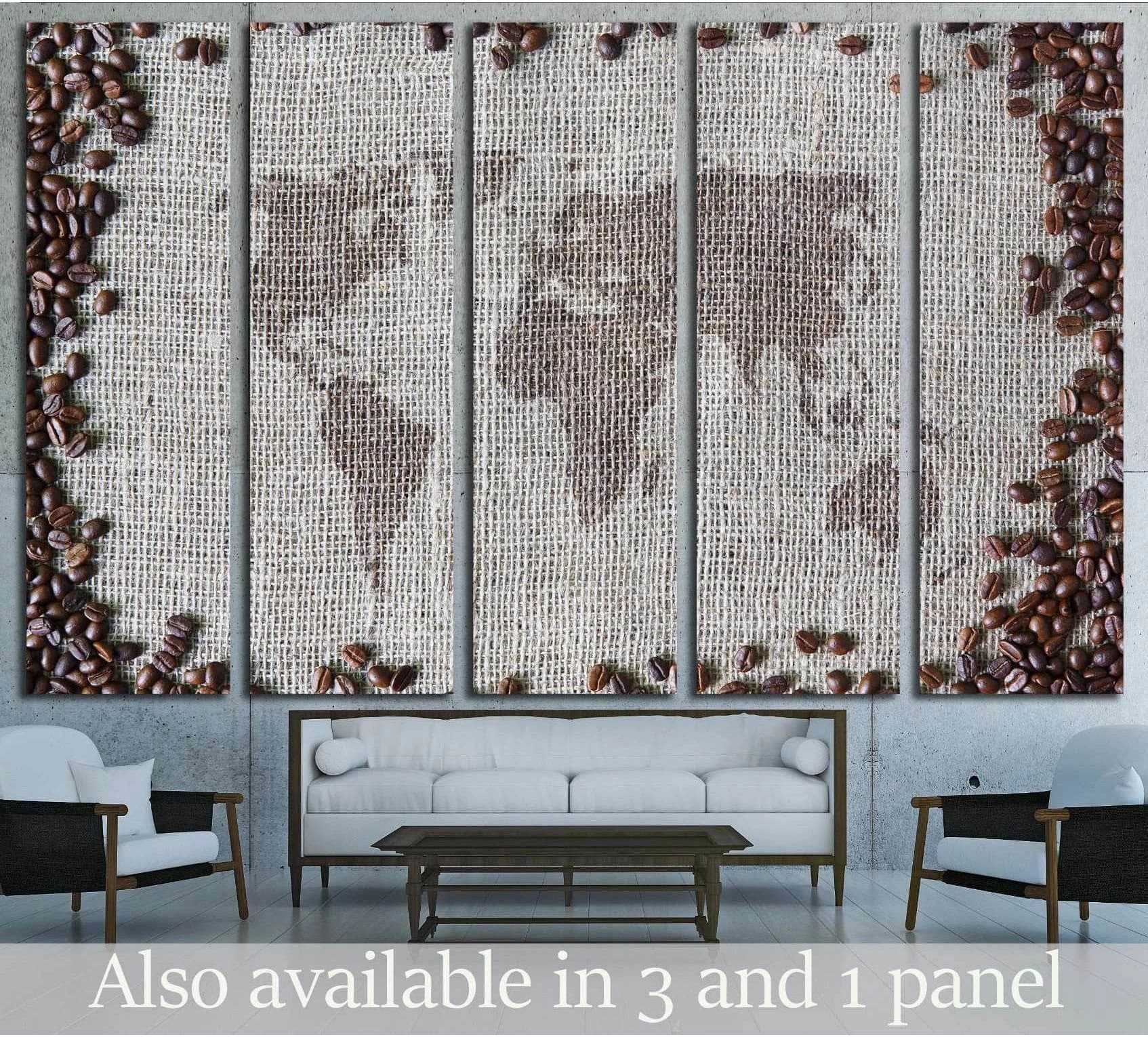
Story Mood
coffee beans, background with world map in the middle №1916 Ready to Hang Canvas Print
£60.82
Available now
Best placement: Independent café, roastery, travel-themed kitchen.
Coffee plus map imagery adds global sourcing and story value.
View print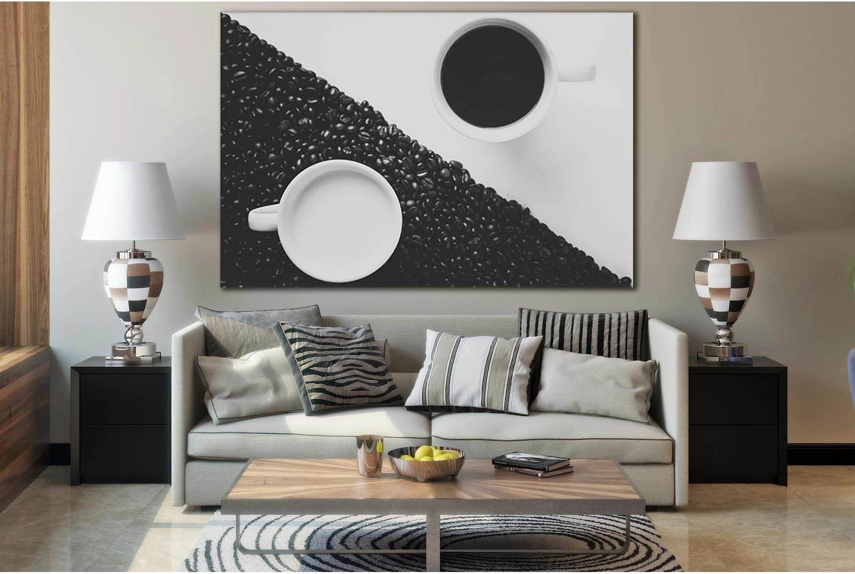
Quiet Mood
Monochrome Coffee Yin Yang Canvas Print with White Cups
£60.82
Available now
Best placement: Minimal café, black-and-white kitchen, small coffee corner.
Monochrome coffee art gives a cleaner, calmer version of café theming.
View print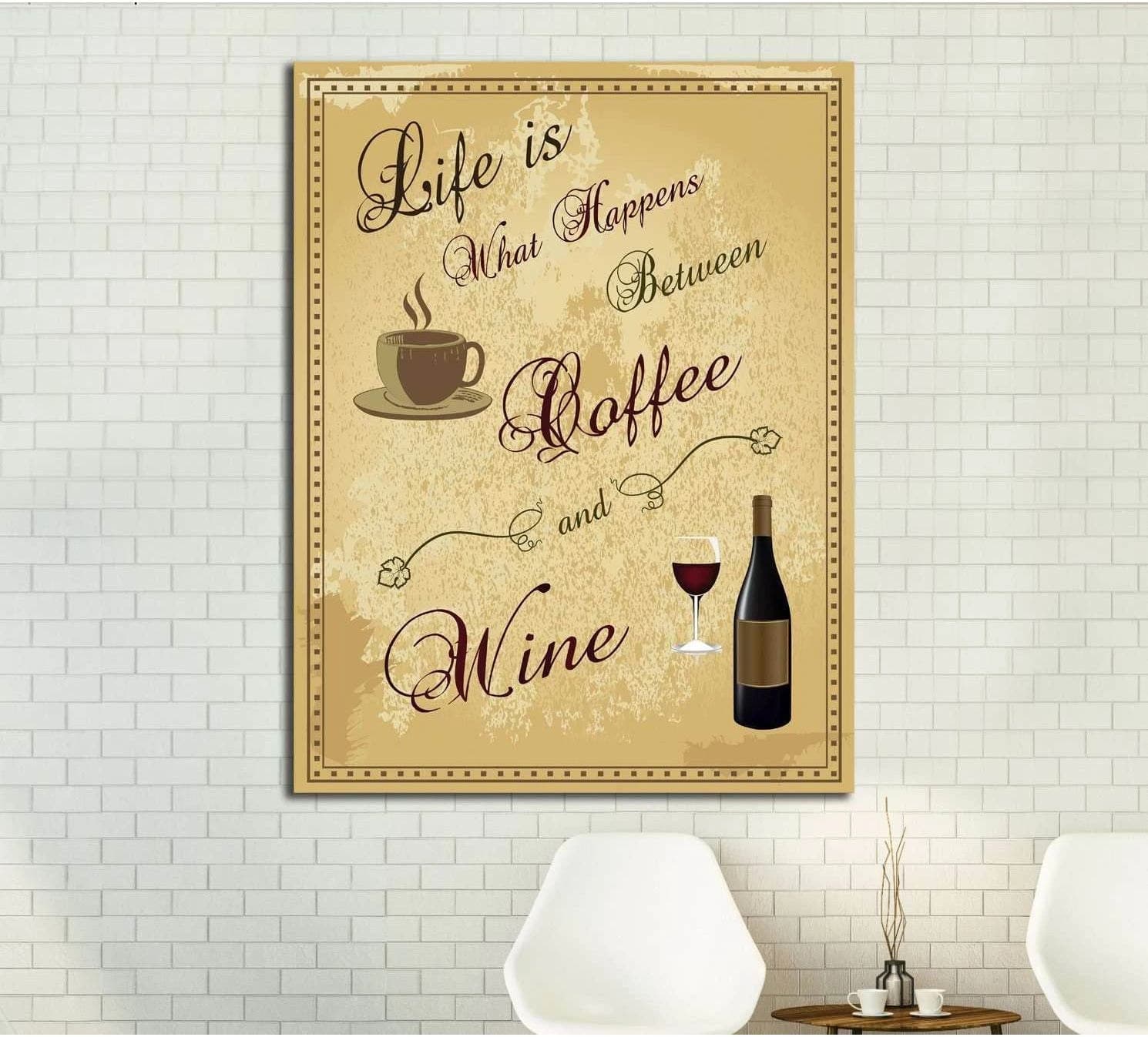
Evening Mood
Beige Coffee and Wine Typography Canvas Wall Art
£79.78
Available now
Best placement: Wine bar, bistro, dining room, evening café.
Coffee and wine cues work well in spaces that shift from day to night.
View printWhat is the hotel-lobby method for choosing art?
Choose the first impression
Decide whether the room should feel calm, social, luxurious, creative, coastal, urban, intimate or energetic.
Pick the visual anchor
Select the wall people see first or longest. That wall deserves the strongest piece.
Use scale before detail
A large, readable artwork usually has more room power than several small pieces.
Control the colour signal
Cooler art slows a room down; warmer and higher-contrast art wakes it up.
Add one memory hook
A skyline, bridge, strong abstract colour, coffee motif, map or ocean horizon gives the room a phrase people can remember.
What did the research show?
This article used four evidence layers: hospitality case studies, environmental psychology, visual perception research and Zellart product/category fit. Hospitality examples came from Four Seasons design commentary, Four Seasons Madrid coverage in Sleeper, Ace Hotel’s Artist in Residence programme, W Hotels’ design language and Design Hotels’ discussion of Kelly Wearstler’s Downtown L.A. Proper interiors.
Psychology references came from servicescape theory, hospitality art-experience research, retail atmosphere studies and colour-emotion research. Art Basel and UBS were used only as macro art-market context: their 2026 report states that global art market sales rose 4% to $59.6 billion in 2025, while the report focuses on dealers, auctions, fairs, transactions and regional market share rather than a separate hospitality-acquisition category.[15]
FAQ: What do hotel lobbies know about art?
Why does hotel lobby art feel more expensive than home art?+
Hotel lobby art often feels expensive because it is chosen for scale, placement, lighting, and emotional effect, not only for colour matching. The artwork usually has a clear role: to welcome, impress, orient, calm, energise, or create memory. Homes feel more hotel-designed when one piece becomes the room’s anchor.
What size artwork gives a home a hotel-lobby feeling?+
The most hotel-like effect usually comes from one large artwork on the main sightline wall. As a Zellart styling rule, choose art that feels visually readable from the doorway, not only from close up. Above a sofa, console, bed, or dining bench, bigger usually feels more intentional than several small pieces.
Should home art match the furniture?+
Home art should relate to the furniture, but it should not disappear into it. Hotel designers often create harmony through one shared thread — colour temperature, frame tone, subject, or mood — while allowing the artwork to have enough contrast to be remembered.
Are cityscape prints good for cafés and restaurants?+
Cityscape prints work well in cafés and restaurants because they create depth, pace, and a memorable urban atmosphere. They are especially useful in narrow spaces, corridors, bar walls, and dining rooms where a skyline or bridge perspective can make the room feel larger and more designed.
What is controlled randomness in wall art?+
Controlled randomness is a curated look where artworks feel varied but still connected. The collection may mix subjects and scales, but it keeps one rule consistent, such as colour palette, frame style, city theme, coastal mood, or abstract line language. It feels collected, not chaotic.
What colours work best for business wall art?+
Cool blues, greens, and soft neutrals usually support calm, trust, and waiting; warm reds, oranges, ambers, and high-contrast abstracts support energy, appetite, and social spaces. Colour meanings are not universal, so lighting, culture, material, room function, and customer expectation must be considered.
What is the biggest mistake homeowners make with art?+
The biggest mistake is treating art as the final gap-filler. Hotel lobbies start with the mood and then choose art to support it. Homeowners can get the same effect by deciding what the room should say first, then choosing the artwork’s size, colour, subject, and placement.
Zellart editorial
Read more
Three related Zellart essays to keep the thread going.

Art & Design
The Beige International
How Airbnb, staging and ecommerce taught rooms to look the same, and why walls still need to argue for someone.
Read article
Art & Design
The Persistence of Mirage
Rome, surrealism, Dubai and deepfakes show how spectacle became a technology of belief.
Read article
Art & Design
The Room That Stares Back
A case for dark, human maximalism through AI images, deep-ocean life, Medusa, protest graphics and Tokyo vintage.
Read article