


Visual read
Subject, style, and first impression
The public-facing facts a shopper can understand at a glance.
Scene
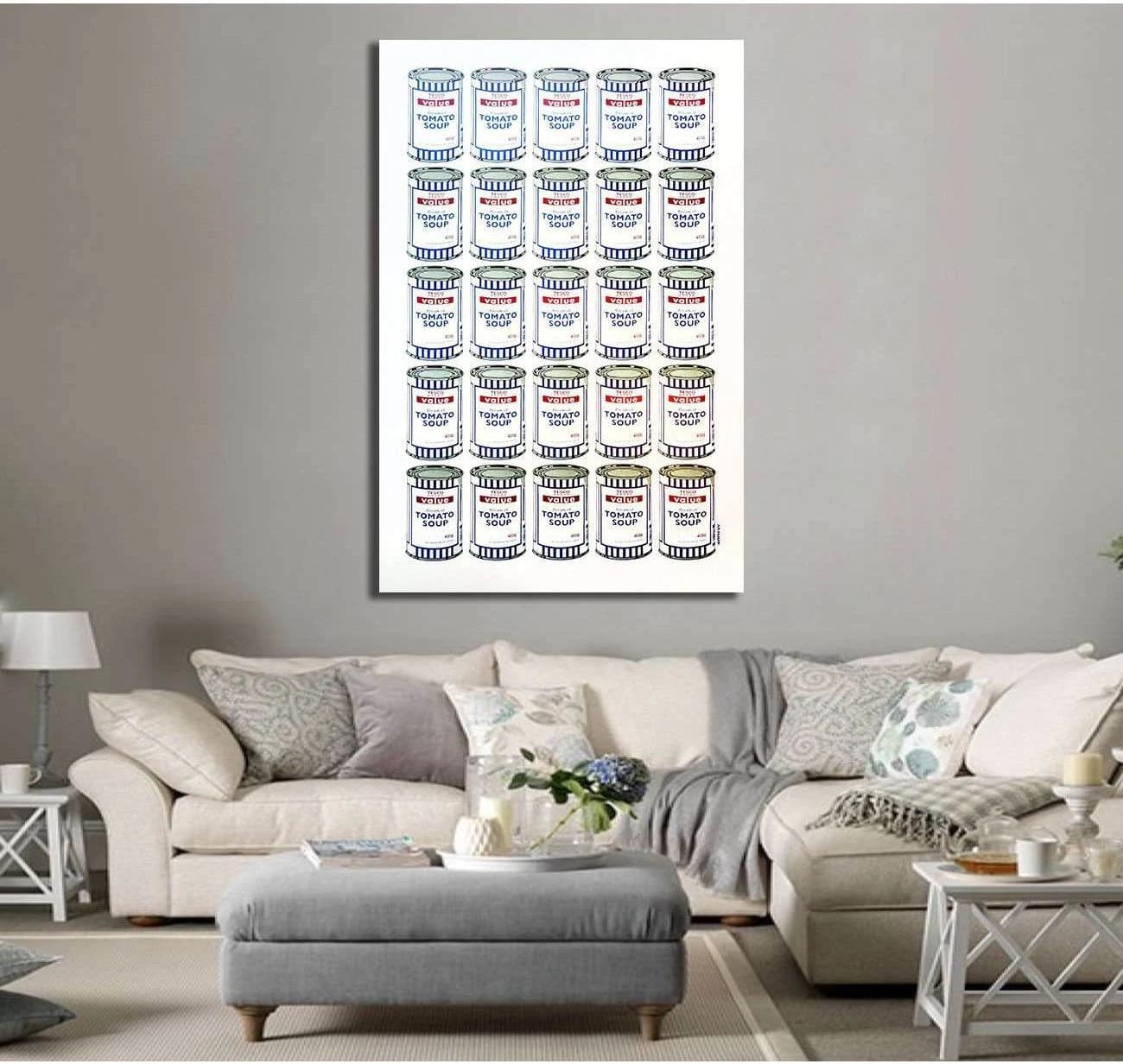
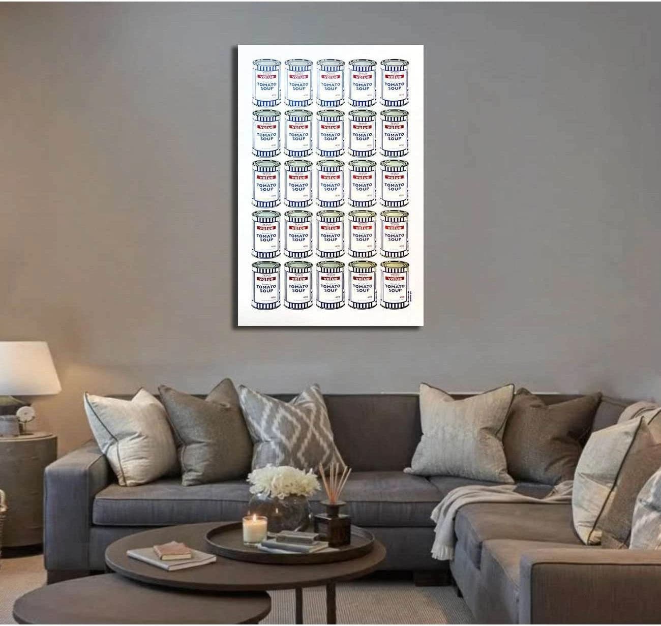
ALL-OVER COMPOSED GRID OF PRODUCT CAN LABELS
Subject count
MULTIPLE
Human presence
NONE
Readable text
TESCO
Medium look
LINE-ART STYLE
Abstraction
SEMI-REALISTIC
Realism
ILLUSTRATIVE
Detail
DETAILED
Texture
FLAT
Pattern
STRONG PATTERN
Era feel
CONTEMPORARY
Visible subject tags
Style and decor tags


